
Surveys
Info
Mapping human sentiment across decentralized networks. For Surveys—a crowd-intelligence platform operating on the World Network—my execution focused on designing the core desktop client interface alongside crafting the launch website. The web client provides total operational control, allowing users to seamlessly create the surveys populating the mobile app, track real-time results, and drill down into individual respondent data. The final delivery pairs this deep utility with a premium digital presence built for global scale.
Mapping human sentiment across decentralized networks. For Surveys—a crowd-intelligence platform operating on the World Network—my execution focused on designing the core desktop client interface alongside crafting the launch website. The web client provides total operational control, allowing users to seamlessly create the surveys populating the mobile app, track real-time results, and drill down into individual respondent data. The final delivery pairs this deep utility with a premium digital presence built for global scale.
Year
2025
Client
Ottofeller
Services
Product Design & Web Experience


Human-Centric Insight
Human-Centric Insight
While the consumer-facing mobile application was already optimized to capture real-world human opinions, the platform lacked the transactional engine to generate them. To make the ecosystem viable for enterprise and research clients, we needed a powerful, zero-to-one business portal. I architected the entire desktop web interface from scratch—a unified console where corporate clients can configure, fund, target, and analyze highly verified surveys. By leveraging the underlying human-credential network to guarantee 100% Sybil-resistant, authentic responses, the portal turned raw consumer reach into a highly defensible, high-value data asset.
The primary challenge of this management interface was establishing immediate trust for enterprise buyers while maintaining the clean, lightweight visual tone of the consumer brand. Grounded in a strict layout grid, the dashboard homepage balances dense transactional statuses (Draft, Pending, Active, Paused, Completed) with at-a-glance budget tracking and real-time response counters. This structural clarity ensures that corporate decision-makers can monitor their entire intelligence pipeline in seconds, establishing the console as a vital operational tool rather than a standard configuration dashboard.
While the consumer-facing mobile application was already optimized to capture real-world human opinions, the platform lacked the transactional engine to generate them. To make the ecosystem viable for enterprise and research clients, we needed a powerful, zero-to-one business portal. I architected the entire desktop web interface from scratch—a unified console where corporate clients can configure, fund, target, and analyze highly verified surveys. By leveraging the underlying human-credential network to guarantee 100% Sybil-resistant, authentic responses, the portal turned raw consumer reach into a highly defensible, high-value data asset.
The primary challenge of this management interface was establishing immediate trust for enterprise buyers while maintaining the clean, lightweight visual tone of the consumer brand. Grounded in a strict layout grid, the dashboard homepage balances dense transactional statuses (Draft, Pending, Active, Paused, Completed) with at-a-glance budget tracking and real-time response counters. This structural clarity ensures that corporate decision-makers can monitor their entire intelligence pipeline in seconds, establishing the console as a vital operational tool rather than a standard configuration dashboard.
Strategic Constraints
Strategic Constraints
Operating on an accelerated launch timeline with the CEO left zero room for design overhead or speculative engineering. In high-stakes product design, speed is driven by radical simplification. Instead of building a complex, heavy drag-and-drop survey creation editor for the MVP—which would have dramatically extended the engineering cycle—we made a strategic, pragmatic compromise. We chose to offer a premium, "white-glove" setup service.
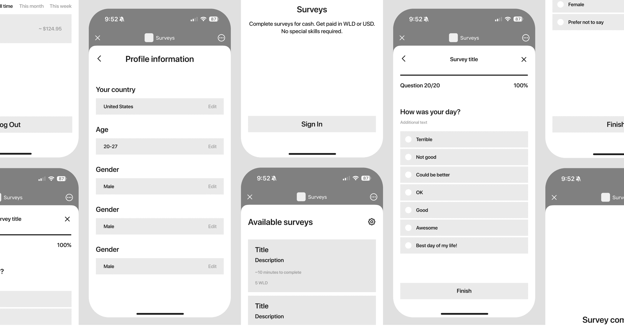
Under this streamlined workflow, clients simply input basic campaign parameters, define their target volume, and upload their existing questionnaire as a raw document (PDF, CSV, or image). Our administrative team then configures the digital survey in the background within 24 hours. Once configured, the console dynamically renders a high-fidelity, interactive mobile device preview directly within the client's review screen. This live rendering bridges the gap between raw data and the end-user experience, allowing clients to test the exact mobile interface, typography, and localized translations before hitting publish. By making the final sign-off visual and absolute, we bypassed months of complex editor development, slashed time-to-market, and successfully validated demand on day one.
Operating on an accelerated launch timeline with the CEO left zero room for design overhead or speculative engineering. In high-stakes product design, speed is driven by radical simplification. Instead of building a complex, heavy drag-and-drop survey creation editor for the MVP—which would have dramatically extended the engineering cycle—we made a strategic, pragmatic compromise. We chose to offer a premium, "white-glove" setup service.
Under this streamlined workflow, clients simply input basic campaign parameters, define their target volume, and upload their existing questionnaire as a raw document (PDF, CSV, or image). Our administrative team then configures the digital survey in the background within 24 hours. Once configured, the console dynamically renders a high-fidelity, interactive mobile device preview directly within the client's review screen. This live rendering bridges the gap between raw data and the end-user experience, allowing clients to test the exact mobile interface, typography, and localized translations before hitting publish. By making the final sign-off visual and absolute, we bypassed months of complex editor development, slashed time-to-market, and successfully validated demand on day one.

Intentional Boundaries
Intentional Boundaries
A survey is only as valuable as the precision of its respondents. If targeting parameters are too loose, the data is useless; if the interface is too complex, the client abandons the flow. To balance these competing priorities, I engineered a dense but highly scannable demographic filter matrix that allows clients to precisely define their audience criteria directly within the campaign creation step.
To achieve this, I isolated the targeting variables into an organized, expandable criteria panel. When setting up a survey, the client is presented with a series of clean, stacked selection tags spanning demographic filters such as location, verification status, age, and employment. Rather than overwhelming the user with massive open inputs, each targeting criterion acts as an accordion filter that only exposes complexity when interacted with. This visual breathing room keeps the workflow clean, helping clients build precise, human-verified audience targets without cognitive fatigue.
A survey is only as valuable as the precision of its respondents. If targeting parameters are too loose, the data is useless; if the interface is too complex, the client abandons the flow. To balance these competing priorities, I engineered a dense but highly scannable demographic filter matrix that allows clients to precisely define their audience criteria directly within the campaign creation step.
To achieve this, I isolated the targeting variables into an organized, expandable criteria panel. When setting up a survey, the client is presented with a series of clean, stacked selection tags spanning demographic filters such as location, verification status, age, and employment. Rather than overwhelming the user with massive open inputs, each targeting criterion acts as an accordion filter that only exposes complexity when interacted with. This visual breathing room keeps the workflow clean, helping clients build precise, human-verified audience targets without cognitive fatigue.


Analytical Clarity
Analytical Clarity
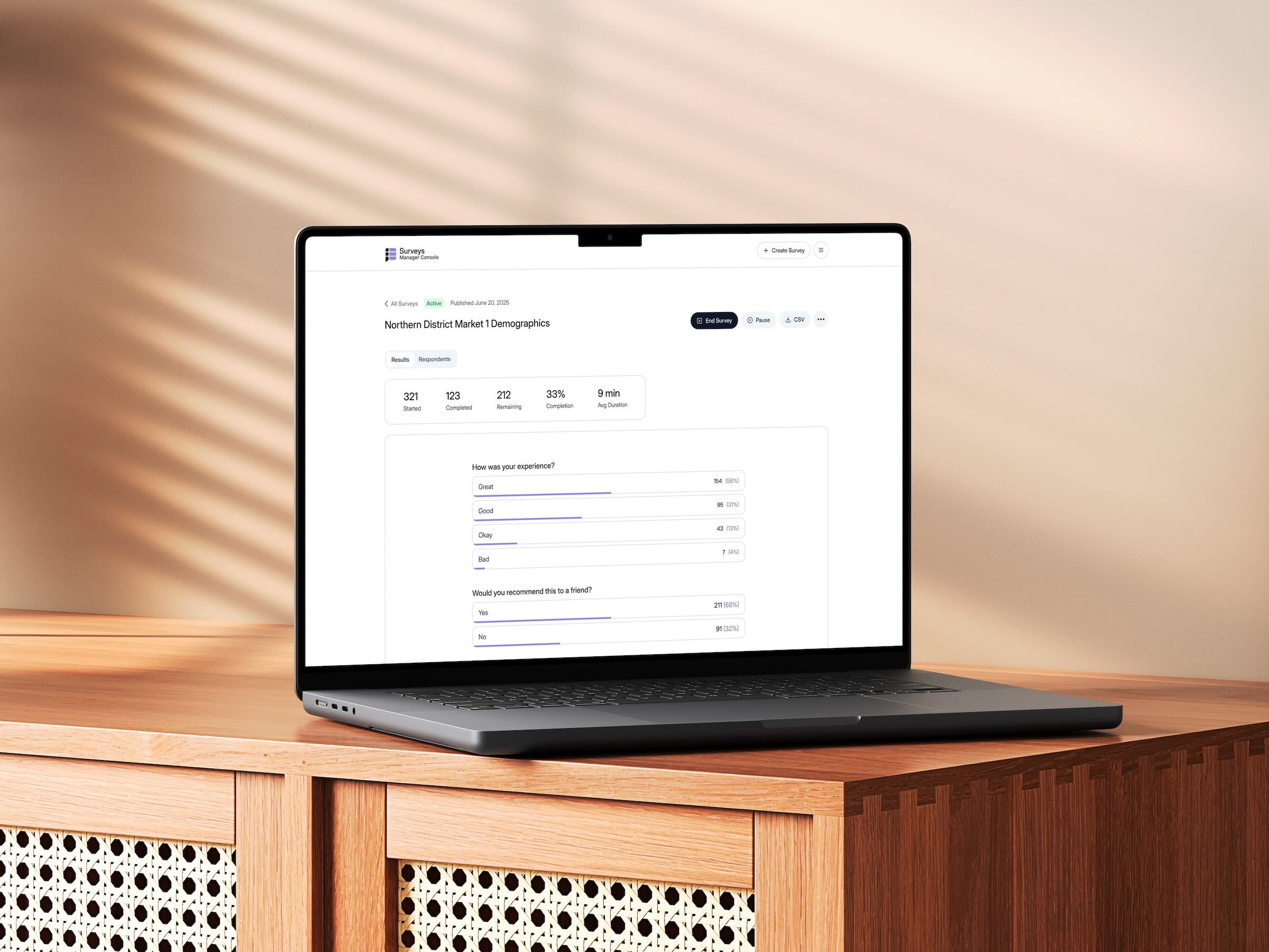
Gathering thousands of authenticated responses is meaningless if client teams cannot easily parse the resulting data. To address the post-survey experience, I engineered an analytical dashboard that visualizes survey progress and aggregate statistics. The UX strategy avoids artificial narrative tension, focusing instead on the rigorous, everyday task of making diverse data points visually cohesive, highly legible, and immediately actionable for corporate stakeholders.
To accommodate different analytical mindsets, I structured the information architecture into a clear two-tab system: Results and Respondents. Under the Results view, the interface focuses entirely on aggregate insights, translating varied data formats—such as yes/no decisions, multiple-choice preferences, and open-input text comments—into a standardized visual language of horizontal progress bars and scannable accordion lists. Conversely, the Respondents view caters to granular validation by displaying a dense, tabular directory of individual participant profiles, complete with progress states, demographic metadata, and specific response trails. This clean split successfully separates high-level executive summaries from deep-dive auditing, giving data analysts the precise tools they need.
Gathering thousands of authenticated responses is meaningless if client teams cannot easily parse the resulting data. To address the post-survey experience, I engineered an analytical dashboard that visualizes survey progress and aggregate statistics. The UX strategy avoids artificial narrative tension, focusing instead on the rigorous, everyday task of making diverse data points visually cohesive, highly legible, and immediately actionable for corporate stakeholders.
To accommodate different analytical mindsets, I structured the information architecture into a clear two-tab system: Results and Respondents. Under the Results view, the interface focuses entirely on aggregate insights, translating varied data formats—such as yes/no decisions, multiple-choice preferences, and open-input text comments—into a standardized visual language of horizontal progress bars and scannable accordion lists. Conversely, the Respondents view caters to granular validation by displaying a dense, tabular directory of individual participant profiles, complete with progress states, demographic metadata, and specific response trails. This clean split successfully separates high-level executive summaries from deep-dive auditing, giving data analysts the precise tools they need.

Unified Execution
Unified Execution
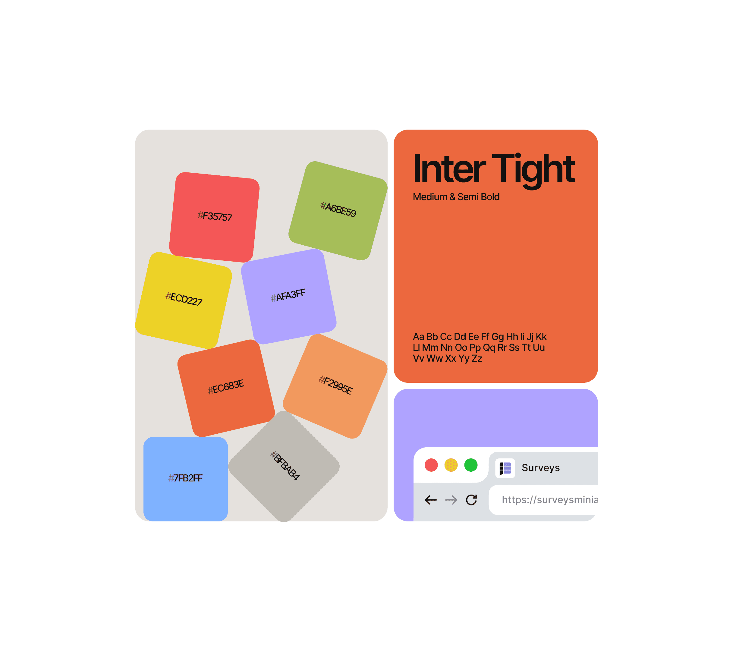
Designing a high-fidelity web utility with speed requires extreme structural discipline. By architecting a highly systematic design system and UI kit for the manager console early in the process, I established the operational leverage needed to design the official marketing launch website in parallel. This concurrent execution ensured that our core desktop tool debuted alongside a polished, public-facing brand presence—completing the product ecosystem and proving that systematic efficiency can dramatically accelerate time-to-market without ever compromising execution quality.
Designing a high-fidelity web utility with speed requires extreme structural discipline. By architecting a highly systematic design system and UI kit for the manager console early in the process, I established the operational leverage needed to design the official marketing launch website in parallel. This concurrent execution ensured that our core desktop tool debuted alongside a polished, public-facing brand presence—completing the product ecosystem and proving that systematic efficiency can dramatically accelerate time-to-market without ever compromising execution quality.